More fun with Scatter Plots
I have mixed feelings about scatter plots. One the one hand you´re showing each individual kid which can be a useful corrective against the fact that taking averages can obscure interesting outliers and patterns. However, the strength of showing everybody is also a weakness as it´s very difficult to compare one scatter with another or to get an impression of how a year/class is doing overall because there are so many different pieces of information to process. It can also be hard to convey to teachers how to use them productively because (as we´ll see) a simplistic above the line good, below the line bad approach is misguided.
There are also BI specific problems we need to address, but first lets look at the properties of the visual. My sample data is described in a previous post, my pbix is here and you can download it here.
The Scatterplot controls
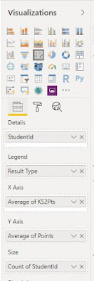
Details: StudentID – that means each student gets their own dot.
There are also BI specific problems we need to address, but first lets look at the properties of the visual. My sample data is described in a previous post, my pbix is here and you can download it here.
The Scatterplot controls

Details: StudentID – that means each student gets their own dot.
Legend: Result type – that means the results for each
Result Type are calculated separately and their dots have their own colours
X Axis: Average of KS2Pts – each kid only has one value for KS2 Pts so the average is that value.
Y Axis: Average of Points – Points here refers to internal assessment grades so here multiple values will exist. If you use filters to choose a single Subject, Year and Term then you’ll get that value. But if say you filter to Year 11, Autumn but English, Maths and Science then you’ll get one dot per student and its position will be the average of those three subjects’ grades.
Size: Count of StudentId – you might think that this will tell you how many students are at a particular KS2/KS4 intersection but you’d be wrong because remember, each student gets their own dot. So if you have three subjects (or years or terms) visible and the *same kid* has three grade 5s then their dot will be three times the size. But if you have three kids with the same x and y values then their three dots will be on top of one another and you will only see one of them. Hovering over them with a tooltip will also only reveal one.
Dealing with the Student superposition problem
What we need to do is
alter the value of each kid’s output so they’re no longer exactly identical,
which you can do by creating a measure (New Measure on the Modelling Tab).
YaxisOffset = AVERAGE(Merge1[Points])+ (RANDBETWEEN(-4000,4000)/100000)
AVERAGE(Merge1[Points]) is what happens when you drag the Merge1[Points] field onto the visual and set the summarization to Average. The measure merely adds a random number between -0.004 and 0.004 so that two dots with the same values are no longer in exactly the same place.
There´s obviously a trade off here because you make each kid more visible by making the output less accurate so play with the values in the measure until you have a good balance (also consider doing the same to the x axis value)
Adding a tooltip page
The obvious piece of info you need to make your scatter worthwhile is who each dot is. You can do this easily by dragging your students´name field into the tooltip property of the visual. To get maximum value out of the visual though, a better option is to create a tooltip page.

On the new page, open the formatting menu and under page information set the type to Tooltip. Under size select Tooltip (for now - tooltip pages can be any size)

We need a measure to give us the kid´s name and basic details, mine is:
Name = SELECTEDVALUE(Students[StudentId]) & ", " & SELECTEDVALUE(Students[Lastname]) & ", " & SELECTEDVALUE(Students[Firstname])
Add a card visual to the page and add the measure (you´ll need to reduce the font size down from the default of 45 to something more like 15.
SELECTEDVALUE gives the value in a column when it is filtered down to one value, so on the page design (which has no filter context) name will be blank but when we hover over a dot the filter context will be just one kid so it will show their name.
Tooltip page with performance in other subjects
As well as a name label we can use the tooltip page to show other information about the kid, like their performance in other subjects. To do this we need a bit of DAX because the filtering that applies to the scatter also applies to tooltips of the scatter. So if we have a regular chart that uses the subject from our results table as its axis then it will only show the subject we´re filtered to on the scatter.
The first step is to create a table that has the values from our results table. Click New Table from the modelling and use ALL to create the table.
<tablename> = ALL([Column1],[Column2]...) gives you all the unique combinations of values in the chosen columns. Mine looks like this (the semicolons will be commas for you, I´m just using a spanish computer)

This table will automatically update with any new subjects or terms that come along, but crucially we´re not going relationships to it so it won´t be affected by any visual´s filter context.
We´re now going to create three measures for our tooltip graph - one to show us the grade in all subjects, one to give us the national average and one to tell us if the subject is the one we have selected in our scatterplot filters. The formula for these are going to leverage two important concepts, one is SELECTEDVALUE which as we´ve seen takes the value in a column when the filter context reduces it to a single value. The second is CALCULATE which allows us to evaluate an expression in a different filter context. What that means is that if we specify a filter on a column (in this case Merge1[Subject]) it will take override any filter context that exists on that column.
So the first measure is
AllSubjects =
VAR SID = SELECTEDVALUE(Students[StudentId])
VAR SUB = SELECTEDVALUE(MergeValues[Subject])
RETURN
CALCULATE(AVERAGE(Merge1[Points]),Merge1[StudentId]=SID,Merge1[Subject]=SUB)
Where Students is the students table, MergeValues is the table from DAX we just created and Merge1 is the table with the results on it. VAR here stands for Variable - I´m going to write a post soon about why variables are awesome and I use them all the time, but for now it´s enough to know that you can declare variables after VAR and then use them in a final expression prefixed by RETURN (you can also refer to variables in subsequent variables).
National Average you get by the following measure:
National Expectation = CALCULATE(Max(Merge1[Points]);Merge1[Result Type]="National Expectation")
To tell if the subject is the selected subject we just need to compare the SELECTEDVALUE of Merge1[Subject] with MergeValues[Subject] like this:
SelectedSubject =
VAR Sub = SELECTEDVALUE(MergeValues[Subject])
VAR SelectedSub = SELECTEDVALUE(Merge1[Subject])
RETURN
IF(SUB=SelectedSub,1,0)
I put these three measures into a line and stacked column chart on my tooltip page like this
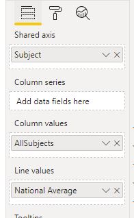
Now we want to use the selected subject measure to conditionally format the colour so the selected subject is a different colour to the rest. In the formating options for the line graph, go to Data Colours and next to ´Default colours´click the dots to access the conditional formatting menu.

Change ´based on field´ to the selected subject measure and choose a minimum colour (for all other subjects) and a maximum colour (for the selected subject).

Finally, I changed the sort order for the chart to AllSubjects ascending so that it will put the subjects in order from lowest to highest.
The last step is to tell the scatter plot to use our tooltip page as its tooltip. To do this, go back to the scatterplot, select it and choose the tooltip page in the Tooltip section of the formatting settings

Here's my tooltip - I've only got three subjects in my dataset so if you have a full range you might want to remove the x axis labels and the data labels - really the key info here is the position of the selected subject (light blue) relative to the others and the national average.

Tooltip page with performance in prior terms
You can use the same basic architecture to give you a summary of performance in previous terms as the MergeValues table also has terms on it. Using the following measure:
AllTerms =
VAR SID = SELECTEDVALUE(Students[StudentId])
VAR SUB = SELECTEDVALUE(Merge1[Subject])
VAR Term = SELECTEDVALUE(MergeValues[Term])
RETURN
CALCULATE(AVERAGE(Merge1[Points]),Merge1[StudentId]=SID,Merge1[Subject]=SUB,Merge1[Term]=Term)

Using National Estimate/Most Likely Grade as a Target
This isn't strictly to do with BI but we've strayed too close to one of my hobby horses for me not to jump on. The widespread practice of using an estimate from national data as a target grade is the worst use of data in the education sector and it has to beat some stiff competition to claim that title. To understand why we need to think about how we arrive at these grades - if the MLG is a 5 what does that actually mean? It means that in a large set of kids with a given prior attainment 5 was the mid point of a range of outcomes:

It's true that 5 was more common that any other single grade - but it's also true that significant numbers of kids get lower grades and, in nearly all cases, a higher proportion of kids achieve a higher grade (ie the proportion of kids getting 6 or 7 or 8 or 9 is greater than that getting 5).
Imagine you're a running coach of a group of kids and your job is to make their average time in the 100m 15 seconds. If you said to the kids who ran 15 seconds exactly on their first try - 'good job, you hit the showers while I stay and shout at the fat kids' that would be stupid right? Yet that's exactly what we do when we make the mid point of expected outcomes everybody's target.
Ah! you say, but we use the MLG from the TOP 5% OF SCHOOLS! So our targets are ambitious and not dumb and stupid at all!
Also wrong.
Here's a sample of estimates from the top 50%, top 25% and top 5% of schools for a given level of prior attainment, it's from a couple of years ago hence the letter grades, but the principle hasn't changed

Some things to note here:
Using the top 5% does shift the MLG from a D to a C (but this won't always be the case - note how similar the distributions are to one another)
In that top 5% bracket (ie the very best schools for value added) nearly half of kids got a lower grade than the MLG (49%).
But, and this is crucial, 17% - which is around 5 kids out of a class of thirty - got a higher grade.
Teachers resent these targets as inappropriately high with good reason (even in the best schools half of kids get less) - so it's really counter intuitive to think that 5 kids in every class should be *exceeding* the supposedly very ambitious target. Yet getting those higher grades is what puts those schools in the top 5% for VA.
Think about it another way - if you had a class of kids with this exact prior attainment and (just like in the best schools) half of them are below their MLG but the other half are getting it exactly - where's the underachievement? It's the kids who are "On Target"! Your whole messaging to teachers, to parents to the kids themselves is that they are doing well and other kids are doing badly when in fact the opposite is true.

Alternatives to MLG
One way round the problem of the MLG as target is to track the percentage of kids getting a higher grade. (17% is not a magic number by the way, just the example from a particular PA and subject - across all prior attainment levels you want to be aiming more for 20%-30% above the MLG).
To calculate the percentage of grades above national average (in a data set where every kid has a grade with that national expectation in it) you can use:
AboveNationMean =
SUMMARIZE(Merge1,Merge1[StudentId]),
"Grade", CALCULATE(MAX(Merge1[Points]),Merge1[Result Type]="Current"),
"Estimate",CALCULATE(MAX(Merge1[Points]),Merge1[Result Type]="National Expectation"))
VAR AboveEstimate = FILTER(Summarytable,[Grade]>[Estimate])
RETURN
COUNTROWS(AboveEstimate)/COUNTROWS(Summarytable)
Here the variables are both tables. SUMMARIZE gives us a table with all the values of studentid in the current filter context. You can add the summary columns within the SUMMARIZE expression (and if you did that you wouldn't need the CALCULATES) but you get better performance by using ADDCOLUMNS and CALCULATE.
In School Variation
Another option is to compare performance in each subject with the average in all other subjects (as for our tooltip) but to use that value as a conditional formatting value so it's obvious when looking at a scatter who's above/below their average in their other subjects. (Hat tip to Stephen Paine, @SJAPaine for pointing this out to me).
(obviously this works best if you're not depressing potential in all subjects by using an estimate as a target)
We need a slightly different measure to do this then for our tooltip as we won't have another table to supply values from outside the filter context, but the key principle is the same - putting a filter on Merge1[Subject] as a condition in CALCULATE will replace the filter context we have on that column.
In School Variation =
VAR Pts = AVERAGE(Merge1[Points])
VAR Sub = SELECTEDVALUE(Merge1[Subject])
VAR OtherSubAvg = CALCULATE(AVERAGE(Merge1[Points]),Merge1[Subject]<>sub)
RETURN
Pts-OtherSubAvg
We can use this measure to conditionally format our scatter points, by going to the formating option for the visual, and clicking on the dots next to default colour in data colours.
 BUT! and this threw me for a bit, you have to remove the legend field first as this option is only available if you have a single series in your data.

Comments
Post a Comment