Scatter Plot with National Data

Get the Data
You can download my pbix to follow along with here. I’ve
used a dummy result set with a student table including KS2 Results (average KS2
is used so we only need one value per student). My results follow a pretty
common format of Result Type, Subject, Year and Term.
To get the national data I googled ‘transition matrices’
and got to here on gov.uk https://www.gov.uk/government/publications/ready-reckoners-and-transition-matrices-for-key-stage-4
(pro tip: the ODS files have less protection so are less hassle then the Excel
versions).
The file looks like this which is what’s known in the trade
as a right f*£&!ng state.

This needs sorting out before it’s useful in BI.
You could spend the time getting BI or a macro to sort this data out for you
from the get go, but for that to be a worthwhile investment you’re gambling on
the format remaining unchanged in subsequent years which isn’t a great bet
where DfE spreadsheets are concerned. I split the difference, tidying it up a
bit in Excel then doing the rest in Power Query (PQ) which is the program
within a program you get when you click ‘Edit Queries’ on the Home ribbon in
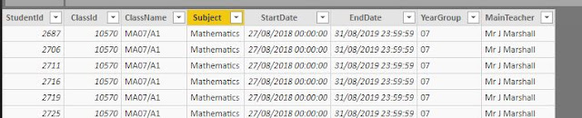
BI. This is what my import from Excel looks like and this is similar to the
table my questioner wanted to combine with his internal student data in a single scatter
plot.
Rethinking the Data Model
A mistake I made a lot when starting out in BI and that I
think my questioner is making too is saying ‘here’s my data model, where can I find a
visual that works with it?’ In this, and most other, cases it’s more fruitful
to ask, ‘how does my data need to change so that the visuals show me what I
want to see?’
What we want to do here is, for a given pupil (and
therefore a given value of the x axis of our scatter), compare two y values –
ie have two series of y value data – one with the internal results and one with
the national comparison. The table we want in BI would therefore look like
this:
Sid
|
Result
Type
|
Subject
|
Term
|
Year
|
Result
|
1
|
Current
|
English
|
Autumn
|
11
|
6
|
1
|
National
Expectation
|
English
|
Autumn
|
11
|
5
|
In lots of schools a target grade based on national
performance will exist in the system and can provide this role already, but I’m
going to cover how to turn the Transition Matrix data into such a grade if it’s
not already there and the techniques for how to this in Power Query (PQ) will probably come
in handy, even if you don’t need them in this specific instance.
Transform your data in PQ
Everything we’re doing here could be done in Power BI using
calculated columns, but when you’re changing the base data of your model,
especially over large tables like results it’s better to use PQ because
calculated columns take up computer resources that could otherwise make your BI
file work faster. (In particular if you find it takes a long time to
create/save measures a likely culprit is the number/complexity of your calculated
columns).
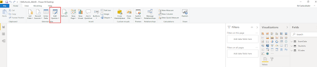
So to load PQ click Edit Queries on the home ribbon.

We’re
going to start with our transition data which I tidied up in Excel, click on 'New Source' and Excel to bring it into PQ. It looks like this:

First up, click Use First Row as Headers if it hasn’t
recognised your header row (numbers as column headings will often throw it).
Because we in some cases want to consider the value not the grade, change ‘U’
to 0.
The next thing we want to do is get all the thing we’re
interested in (the pupil numbers) into a single column (on spreadsheets it's as easy to look across rows as down columns, in databases you tend to do searches/comparisons within columns). Do this by ctrl
clicking subject and KS2 attainment columns, then on the Transform ribbon,
clicking ‘Unpivot other columns’

you should then get this.

Rename the Attribute and Value columns as Grade and Pupils.
Now you need to decide what national value you want. A common choice would be
the most likely grade, in my questioner's sample data he has the mean grade value. We’ll
go through how to get either.
Most likely grade
To get the MLG we need to highlight our subject and KS2
attainment columns again and click Group by from the Home tab.
In the options
that come up chose to add the Max value of the Pupils column as MaxPups. Then
choose to add ‘All Rows’ as an aggregated column with the aggregation ‘All
Rows’ (which gives you a nested table).

Click OK, then expand the All Rows
column using the arrows in the column heading and choose the Grade and Pupils
columns. You’re then back where you were before the Group By operation but with
an extra column showing the maximum number of pupils for a grade for each KS2
value.

Now go to the Add Column ribbon and add a conditional column to give a
value of one where All Rows.Pupils = MaxPups.

Filter to these rows which
contain the MLG
Mean Grade Value
To get the MGV you go through slightly different steps
after the unpivot step. First we need to right click our grade column and
change its type to whole number so we can do maths with it. Next go the
Add Column ribbon and add a custom column to multiply the number of students by
the grade value.
Now you want to highlight the Subject and Prior Attainment
columns and click Group By but the Group By settings will be slightly different
as you don’t need the all rows nested table, just the sum of Pupils and
GradexPupils.

Now add another column dividing SumGxP by SumPupils and that’s
your Mean Grade Value.
Merge Values with internal results
So now we have a query that has subjects, KS2 values and
either the MLG or the MGV. We now need to merge these with our internal results
to create a national expectation result for every internal one we have. This is
a two step process as we need to first look up the KS2 average of the student
then use that to lookup the national value. Lookups in PQ use a process called
merge.
Select the query that contains your internal results and
choose ‘Merge as new’ from the Home ribbon. Merge it with your students table
(or whereever you have your KS2 data), using a left outer join on Studentid.

Expand the merged student table to add KS2.

Now we’re going to merge the newly created query (which
will be called Merge1) with the national values from our earlier query. Before
we do that though you need to check your subjects match up. I’ve got internal
grades for “English” but national values for “English Language”. So I’m going
to pop back to my TransData query, highlight the subject column and use ‘Replace
Values’ from the Transform ribbon to change “English Language” to match my
internal data.

Now back to Merge1 which we’re going to merge with
Transdata (no need to merge as new this time as we already have the new query
to store the merged results). This time we need to merge on 2 values, Subject
and KS2 attainment, so use ctrl click for the second values.

Now use replace values to change the Result Type of the
national values to ‘National Expectation’. If you had multiple result types in
your source data, after doing this use ‘Remove Duplicates’ from the Remove Rows
menu on the Home ribbon so you’re left with just one National Expectation row
for each subject/year/term you have an internal result.
Now we want to combine our National Expectation data with
our internal data. So this means deleting the ‘Points’ and ‘KS2’ Columns and
renaming the national value column as points. Now that they have the same
number of columns, use ‘Append Queries’ on the Home ribbon to add the rows from
Results to the Merge1 query.
That’s the data sorted in PQ – a pretty long walk for a
result you might get straight out of your MIS, but as I said at the start the
PQ techniques are v handy for BI and sorting out your data upstream is more
optimal than doing in BI itself.
Manage relationships of the Model
Our Model is very simple – a students table with KS2 data
on it and a merged table with internal results and national expectations. For
our scatter graph to work though we need to identify students by their results
and that means our results table has to filter our students table as well as
vice versa.
So on the relationships screen there needs to be a
relationship between these tables and the filter direction should go both ways


Make the Scatter
Now the model is sorted making the scatter is easy. Click
to add the Scatter visual from Visualisations. Add the StudentId from Merge1 to
Details. Add KS2 Points as the x Value and use the drop down to change the
summarisation to average. (It’s important to use an aggregated numerical value
here rather than the KS2 Level as that gives us the option of adding a trend
line). Add the average of Points from Merge 1 as the Y value.

Add a Trend Line
To add a line through the national expectation values, go
to the Analysis properties of the visual, expand Trend line, add a trendline
and then untick ‘Combine Series’. (if you don't have the option to add a trend line, check that your KS2 / X axis values are numeric)

You get a line of best fit through the
internal results and the national expectations, like this:
So it’s not exactly the brief, but it’s as close I can get
BI to make it. Please comment below if you can suggest improvements.

Follow Up
For various reasons scatter graphs should be used with caution for this kind of purpose - I'm going to wrap up this post but I'll post about what to watch out for, and how to get the most out of them soon.
Great article. It's really helped me see how I'm going to adapt the data in our school.
ReplyDeleteManaged the graph in Tableau, then saw the pricing!