Covid-19 Monitoring
In an earlier post I explained how to get Covid-19 data from the Public Health England API. You can download my data monitor PBI filehere but you should refer to that post to explain how to create queries to get the specific local authority data you need for your school.
What data is there and how should we monitor it?
The PHE data has different indicators for different area
types (they’re also subject to change so check here for the latest info). At local
authority level you can get new cases, cumulative cases (which is all since the
outbreak began, not all currently ill) and cumulative cases per 100k of population.
I think cumulative cases is irrelevant so I’m monitoring new cases in the past
7 days. Cumulative case rate is also irrelevant but useful for calculating the
borough population.
My tracker also monitors hospitalisation and death figures
although these are only available at the national not the local authority or
regional level.
There obviously isn’t a clear dividing line between a safe
and unsafe number of cases but for context in the week leading up to the
lockdown in Leicester (21st to 28th June 2020) there were
141 new cases per 100k population. At the MAT where I’m currently working we’re
considering 100 cases per 100k a serious concern although obviously the rate of
increase matters too.
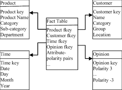
Data Model
My model consists of 3 datasets from PHE
NewDailyCases – this is a separate query for each local
authority I’m interested in, combined into a single table in Power Query
NationalData – a single query with the hospitalisation and
death data
AreaInfo – this is a query for a specific date, the date is
irrelevant it just means we get a list of unique local authorities which allows
us to divide their cumulative cases by their cumulative case rate to get their population
expressed in units of 100k (which I called ‘pop’).
Plus
Students – I’ve got some dummy student data with a borough
for each student. If you need to look up the local authority of students’ postcode
you can download that info from the Office of National Statistics https://geoportal.statistics.gov.uk/
DateTable – a table made in DAX using CALENDAR to control
dates on NationalData and NewDailyCases with a single slicer.
Covid-19 Score
Because the transmission risk to a school community comes
from where the school is and where the pupils live, we came up with the concept
of the Covid-19 Score which incorporates both these factors. This is a particular
concern where I work in London as pupils live in various boroughs, if most of
your kids live in a single local authority it might not be worth it.
The methodology for the Covid-19 score is:
Home Borough Element
= New cases per 100k
population in last 7 days * percentage of students on roll living in borough 1
+ New cases per 100k population in last 7 days * percentage
of students on roll living in borough 2
…repeated for each borough where pupils are resident
School Borough Element
= New cases per 100k population in last 7 days in borough
where school is located
Covid-19 Score = Home Borough Element + School Borough
Element
2
We can calculate this in DAX using ADDCOLUMNS and SUMMARIZE.
The formula is here:
Covid-19 Score =
//Note that this measure takes a
single, hard-coded school site from the measure 'School Location'. For a MAT
this could be the SELECTEDVALUE of the school borough from your schools table
VAR SchoolLocation = [School Location]
VAR CVRefDate = MAX(NewDailyCases[date])-7
VAR Onroll = COUNTROWS(Students)
VAR BoroughProportions = ADDCOLUMNS(
SUMMARIZE(
Students,
Students[Borough]),
"PupCt",
CALCULATE(COUNTROWS(Students)),
"Cases", VAR B = Students[Borough] RETURN CALCULATE(SUM(NewDailyCases[newCasesBySpecimenDate]), NewDailyCases[areaName]=B, NewDailyCases[date]>CVRefDate),
"Pop", VAR B = Students[Borough] RETURN CALCULATE(SELECTEDVALUE(AreaInfo[Pop]),AreaInfo[areaName]=B))
VAR PupilHomeCount =
SUMX(BoroughProportions,([PupCt]/Onroll)*([Cases]/[Pop]))
VAR SchoolCount = SUMX(
FILTER(BoroughProportions,
Students[Borough]=SchoolLocation),
[Cases]/[Pop])
VAR R = (PupilHomeCount+SchoolCount)/2
RETURN
R
Rate of Change
Perhaps more important that any measure of cases is the rate
at which they’re changing. Fortunately time-intelligence functions in DAX make
it pretty straight forward to calculate the Covid-19 score from the previous
week and express the percentage change to this week. The formula DATESINPERIOD returns
a set of dates for the previous week in this measure and can be used as a CALCULATE
modifier:
Change from last week =
VAR LW = CALCULATE([Covid-19
Score],DATESINPERIOD(DateTable[Date],MAX(DateTable[Date])-13,7,DAY))
VAR TW = [Covid-19 Score]
RETURN
DIVIDE(TW-LW,LW)
Mapping borough scores
In theory you can tell BI that say, ‘Merton’ is a place and
then the Maps visual will find it on the map (you do this by clicking on the field
in the field list and choosing a Data Category in Column Tools. My experience with
this hasn’t been great though as Bing seems to think a lot of places in South
London are in Pennsylvania (which to be fair they are…in a sense).
So in order to place my local authority stats on the map I cheated a bit by looking up the postcodes of the council offices for my three sample local authorities (Croydon, Merton and Sutton) and adding a conditional column in Power Query to my AreaInfo table to quasi manually add the postcode to the LA (if areaName = Croydon postcode = …etc)
I have a simple measure for the seven day case count for a
single LA:
SevenDayCaseCountPer100K =
VAR MaxD = MAX(NewDailyCases[date])
VAR MinD = MaxD-7
VAR X =
CALCULATE(SUM(NewDailyCases[newCasesBySpecimenDate]),
NewDailyCases[date] > MinD,
NewDailyCases[date] <=
MaxD)
VAR Bpop = SELECTEDVALUE(AreaInfo[Pop])
RETURN
DIVIDE(X,Bpop)
And my original plan was use the size property of the map
visual to express the differences. The problem with this was that there’s no
way of applying an external scale to the sizes – so Croydon with 5.4 cases per
100k had a bubble three times the size of Merton and Sutton which had 5.3.
Instead I switched to a colour scale for the bubbles. If you go to the Data Colours format property you can conditionally format the colour to get progressively stronger the higher the case count.

Seven day smoothing for deaths
For hospitalisations I used a simple sum of
[nationalData]hospitalCases, but for deaths if you do that it looks like this

To show an average of the last seven days instead this is
the measure I used (note that using ADDCOLUMNS and CALCULATE(SUM… instead of
SUM( inside SUMMARIZE is more principled in terms of maximising performance, but
with the low data volumes we’re dealing with here there’s no discernible
difference)
SevenDayAverageDeaths =
VAR Pend = SELECTEDVALUE(NationalData[date])
VAR PStart = Pend - 7
VAR CombinedNats = CALCULATETABLE(
SUMMARIZE(NationalData,NationalData[date],
"DeathTot",SUM(NationalData[new28DaysDeathsByPublishDate])),
NationalData[date] <= Pend,
NationalData[date] > PStart)
VAR X =
AVERAGEX(CombinedNats,[DeathTot])
RETURN
X
Note that CALCULATETABLE (like CALCULATE) replaces the filter context of fields used as its filters which is important as we need to override the filtering to a single date applied by the X axis of the chart. 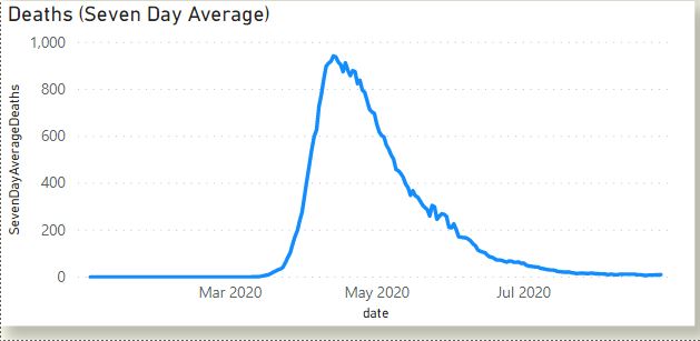
The file is downloadable here and you’re free to adapt and
use it for non commercial purposes. If
you’d like BI training to help you to set it up then please contact me on twitter @Bi4Schools or at ed@rsic.co.uk
I feel SQL, power BI and other tools like these are actually very helpful to provide for more and more aspects of this.
ReplyDeletePowerbi Read Rest