Posts

Dashboard Control Tips and Tricks

Image
Buttons and Bookmarks One of the really cool thing you can do in Power BI is make your dashboards interactive, allowing the user to control the slicer selections and the pages they see using buttons. You do this using 'Bookmarks' which are a saved state of all or part of your report. Consider this very simple example where we have two tables, one with FSM data and one with EAL and we want button controls to determine which is visible. The first step is to go the View ribbon and show the Selection Pane (which lists all the elements on the current page) and the Bookmarks pane. As you can see our two tables are both called 'Table' so the first thing we need to do is sort that out. In the format menu of the visuals click to show their title and give them a name. You can then hide the title again if you don't want it visible on the page, in the selection pane they are now listed under their title. Next to each item in the selection pane is an eye ...

Visuals and the wonderful mysteries of the CALCULATE function

Image
I haven't really talked about visuals much as they're mostly pretty intuitive in BI but there is an issue if you want to produce a graph like this as the obvious steps won't get you there. So that's a bar chart showing the percentage of kids of each gender at low, middle high prior attainment from this Students table. But if you create the bar chart with Gender as the Axis, Prior Attainment as the Legend and Count of student ID as the value you get this: If you click the down arrow next to count of studentid you can use 'show value as....percent of grand total'  but that gives you: (note figures were added by going to the format (roller paint icon of the visual) and turning data labels on) The problem here is that the totals for each segment are being divided by all pupils not by Male/Female totals respectively. Row and Filter Context We can sort this out, but to understand how we need to understand two very important concepts in power...

Looking back in time: Historical Group Membership

In this post I'm going to show how look back in time at your school population on or between two dates. At Bromcom we've just added information on class, year memberships etc which we are calling 'collections' of pupils to distinguish them from the Year and Tutor  Group  fields on the Students table. Our database structure for this is pretty logical: Collections : A master list of groups with IDs and a group type (today I'm using the example of Year Groups which have the CollectionTypeName "OnRollYGrp") Collection Associates : A group memberships table that lists Collection IDs, StudentIDs and the Start and End dates of the membership of the group. CollectionAssociates should relate to Students on SchoolStudentId and to Collections on SchoolCollectionId If you want to play along you can download an excel file with these tables  here Count Members of a year group The first step is to make a measure on CollectionAssociates counting ...

Static Data Tables and Sorting Year Groups

Image
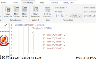
It's often useful to have static data tables in your BI model (one recent example for me is converting ethnicity codes to census categories) and I've been through a process of trial and error to find the best way of doing this. Import from Excel/CSV This is the most obvious: Get Data, Excel, Bosh! But unless you're only going to update your data from PBI Desktop it's not a good idea. If you have Excel/CSV data sources in the file then you can't schedule refresh from  app.powerbi.com .  (you can if you set up a "gateway" and turn your machine into a server but, trust me, this isn't worth it) Google Sheet Next option is a Google Sheet and note that it must be a Google sheet, not simply an xlsx uploaded to Drive.  (Wondering why not an Excel 365 file as it's MICROSOFT Power BI? Hahahaha - you work it out then tell me how please ;)  To connect that to BI: Hit the share button top right hand side of the screen and edit the li...

Benchmarking against National Data

Image
One of the features I was really pleased to add to Bromcom Analytics in BI was the ability to choose between various attendance and KS4 Performance benchmarks from national data. DfE publication is still a little scattergun (although it has vastly improved in the last couple of years) and if you hunt around a bit you can find national, local authority and school level performance at KS4, absence and persistent absence rates and Ofsted ratings. I've collated this data into a sheet you can download here . Be aware that it's 2016-17 data though as that was the latest available when I made it. My aim was to produce a drop down selector that allows the user to place a target indicator alongside their performance.   Green dotted lines show the selected benchmark. The Visual is from the BI Marketplace and called 'Data Bar KPI' Put National Data in the Cloud To do this, I first uploaded my national data set to Google and converted it into a Google Sheet. Now as it...

Improved / Stayed Static / Regressed Assessment Measure

Image
One of the weaknesses of traditional assessment tracking is that combining results from all collections into one large spreadsheet is cumbersome and so you often end up looking at each data drop in isolation. Power BI is much better at handling large data volumes and this post is about how to add as tooltips to a graph showing different cohorts' progress through KS4, the proportion of grades which improved, stayed static or went down from the previous collection. You can follow along with my sample data here . I'm using a datasource called AssessmentResults where results are identified by AssessmentType, YearGroup, Term and Subject and the key result data fields are Result, ResultDate and Points (the numerical value of the result). I'll add my usual disclaimer that there could be more efficient ways of achieving this outcome and if so, please add them in the comments or ask to submit a guest post. Cohort and Stage Columns The first task is adding calculated columns...