Posts

Benchmarking against National Data

Image
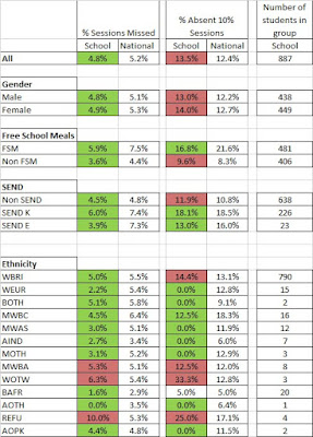
One of the features I was really pleased to add to Bromcom Analytics in BI was the ability to choose between various attendance and KS4 Performance benchmarks from national data. DfE publication is still a little scattergun (although it has vastly improved in the last couple of years) and if you hunt around a bit you can find national, local authority and school level performance at KS4, absence and persistent absence rates and Ofsted ratings. I've collated this data into a sheet you can download here . Be aware that it's 2016-17 data though as that was the latest available when I made it. My aim was to produce a drop down selector that allows the user to place a target indicator alongside their performance.   Green dotted lines show the selected benchmark. The Visual is from the BI Marketplace and called 'Data Bar KPI' Put National Data in the Cloud To do this, I first uploaded my national data set to Google and converted it into a Google Sheet. Now as it...

Improved / Stayed Static / Regressed Assessment Measure

Image
One of the weaknesses of traditional assessment tracking is that combining results from all collections into one large spreadsheet is cumbersome and so you often end up looking at each data drop in isolation. Power BI is much better at handling large data volumes and this post is about how to add as tooltips to a graph showing different cohorts' progress through KS4, the proportion of grades which improved, stayed static or went down from the previous collection. You can follow along with my sample data here . I'm using a datasource called AssessmentResults where results are identified by AssessmentType, YearGroup, Term and Subject and the key result data fields are Result, ResultDate and Points (the numerical value of the result). I'll add my usual disclaimer that there could be more efficient ways of achieving this outcome and if so, please add them in the comments or ask to submit a guest post. Cohort and Stage Columns The first task is adding calculated columns...

Absence Reporting

Image
A colleague recently asked me if I could produce this in BI: This is a classic example of when schools resort to using Excel as very often in an MIS you would need to run/filter several reports to get the breakdown of each group. To do this I first downloaded the most recent national data from the DfE  and then did some copy and pasting in Excel to put it into usable form. You can download my file here , it looks like this: (As far as I know, there isn't a standard DfE data feed that can pull this data automatically - please tell me if I'm wrong about this!) OK so I imported this national data into BI and called it AbsenceGroups I use the following measures to work out pupil absence and persistent absence (see the previous post for more details on Persistent): Absences = sumx(StudentAttendances,if(or(StudentAttendances[MarkMeaning]="U",StudentAttendances[MarkMeaning]="A"),1,0))/sumx(StudentAttendances,if(StudentAttendances[MarkMeani...

Persistent Absentees

Image
One of the challenges I've recently faced is how to get a measure to show persistent absentees (students with <90% attendance), that will respond to any time period on a date slicer. If you want to follow along with this example then you can access a sample data set  or if you just want to visualise I will refer to two tables:  Students - a list of students StudentAttendances - a list of attendance records, with one row per student per session that includes the mark meaning (P - present, E - Approved Educational Activity, A - Absent, U - Unauthorised, C - Cancelled). Students is related to StudentAttendances with a one-to-many relationship. Step 1: Present and Possible My first step was to create two columns on the StudentAttendances table.  Present: = if(or(StudentAttendances[MarkMeaning]="P",StudentAttendances[MarkMeaning]="E"),1,0) Possible  = if(StudentAttendances[MarkMeaning]="C",0,1) Step 2: Attendance% measure Next I created...

Welcome to PowerBIforSchools

Image
Lots of schools and MATs are starting to use Microsoft Power BI as way of interrogating and visualising the data from their MIS systems. BI is great for this and has enormous potential to distill lots of noisy data into simple indicators for time-poor school leaders, but it's also tricky to learn and has the potential to become a beast to maintain for (just as time-poor!) Data Managers. The aim of this blog is to provide resources to help anyone using BI in education and to hopefully become a community of users who can share ideas and help each other out. I'd love to hear from, and host guest posts from anyone using BI for their school or MAT. If you'd like to get involved please contact me in the comments or at ed@rsic.co.uk I'm the Head of Analytics at Bromcom so my day job involves developing resources for schools and MATs using BI and Bromcom's other advanced reporting tools, but this blog is something I'm doing in my own time, welcoming to users of all ...