Absence Reporting
A colleague recently asked me if I could produce this in BI:
This is a classic example of when schools resort to using Excel as very often in an MIS you would need to run/filter several reports to get the breakdown of each group.
To do this I first downloaded the most recent national data from the DfE and then did some copy and pasting in Excel to put it into usable form. You can download my file here, it looks like this:


Note that Absence Groups refers to all students so doesn't need to be related.
Now I was able to create table visuals in BI using the Absence and Persistent measures next to the SecAbs201617 and SecPabs201617 fields of the relevant tables. e.g.
 This is the definition of the Ethnicity table. I renamed 'SecAbs... to 'National' by right clicking on the values after adding them to the table. I've also set their summarisation to 'sum' but since there's only one value for each group it could equally be max or don't summarise (but not the default: count).
The Pupils measure is a very simple measure, Pupils = countrows(students).
The visual looks like this:

Conditional Formatting
I created a measure for each table field to use as the basis for conditional formatting. (I initially used calculated columns but that was a mistake as columns don't respond to filters/slicers.) The syntax of the measures is:
ETHAbsCol = sum(AbsEth[SecAbs201617])-[Absences]
Again, sum here is used because measures require aggregation but this measure will only be used in a row context where there is just value. So for example, when working out the colour for 'Any other Asian Background' it "sums" the single value 2.8% and subtracts the absences value for that ethnicity (5.5%) to give a value of -0.03.
I created 14 of these measures overall, one for Absences and Persistent for each of the seven tables. You don't have to create the measures on the table they look at (measures are table agnostic) but I think it's good practice for maintenance so that's what I did.
To use the measures to apply conditional formatting right click the field you want to format and select conditional formatting, background colour.
In the 'based on field' dropdown select the appropriate col measure. Tick 'Diverging' for a three colour scale and change the Minimum, Center and Maximum drop down types from the default (lowest/highest value) to 'Number'. It's important to do this as otherwise if, say, girls attendance was great and boys was only good, it would colour boys as bad as they had the lowest value for the measure. I used the values -.02, 0 and 0.02 so that values 2% off the national would be strongly red/green with lighter shades for values within that range

I also added a date slicer to the 'Start Date' field of student absences. This controls the Absences and Persistent measures so it means my figures and formatting respond to the date slice. My final page looks like this:


This is a classic example of when schools resort to using Excel as very often in an MIS you would need to run/filter several reports to get the breakdown of each group.
To do this I first downloaded the most recent national data from the DfE and then did some copy and pasting in Excel to put it into usable form. You can download my file here, it looks like this:

(As far as I know, there isn't a standard DfE data feed that can pull this data automatically - please tell me if I'm wrong about this!)
OK so I imported this national data into BI and called it AbsenceGroups
I use the following measures to work out pupil absence and persistent absence (see the previous post for more details on Persistent):
Absences = sumx(StudentAttendances,if(or(StudentAttendances[MarkMeaning]="U",StudentAttendances[MarkMeaning]="A"),1,0))/sumx(StudentAttendances,if(StudentAttendances[MarkMeaning]="C",0,1))
Persistent = countrows(filter(students,calculate(and(StudentAttendances[Attendance%]<.9,isnumber(StudentAttendances[Attendance%])))))/countrows(filter(students,calculate(isnumber(StudentAttendances[Attendance%]),ALLEXCEPT(Students,Students[YearGroupNum]))))
Data Tables
I'm not sure if this is the maximally efficient way of making the various tables (please comment) but it works. I used DAX to make separate tables for each of my absence group types, clicking on the 'New Table' button on the modelling tab, with the syntax <new table name> = filter(AbsenceGroups,AbsenceGroups[Grouptype] = "grouptype")
e.g.
AbsGen = filter(AbsencesGroups,AbsencesGroups[Grouptype]="Gender")
Once I had created six tables in this way, I went to 'Manage Relationships' and joined their 'Group' fields to the relevant field in the Students table.

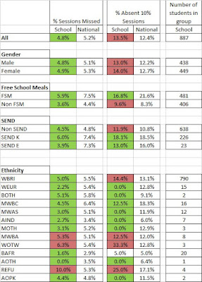
Now I was able to create table visuals in BI using the Absence and Persistent measures next to the SecAbs201617 and SecPabs201617 fields of the relevant tables. e.g.

The Pupils measure is a very simple measure, Pupils = countrows(students).
The visual looks like this:

Conditional Formatting
I created a measure for each table field to use as the basis for conditional formatting. (I initially used calculated columns but that was a mistake as columns don't respond to filters/slicers.) The syntax of the measures is:
ETHAbsCol = sum(AbsEth[SecAbs201617])-[Absences]
Again, sum here is used because measures require aggregation but this measure will only be used in a row context where there is just value. So for example, when working out the colour for 'Any other Asian Background' it "sums" the single value 2.8% and subtracts the absences value for that ethnicity (5.5%) to give a value of -0.03.
I created 14 of these measures overall, one for Absences and Persistent for each of the seven tables. You don't have to create the measures on the table they look at (measures are table agnostic) but I think it's good practice for maintenance so that's what I did.
To use the measures to apply conditional formatting right click the field you want to format and select conditional formatting, background colour.
In the 'based on field' dropdown select the appropriate col measure. Tick 'Diverging' for a three colour scale and change the Minimum, Center and Maximum drop down types from the default (lowest/highest value) to 'Number'. It's important to do this as otherwise if, say, girls attendance was great and boys was only good, it would colour boys as bad as they had the lowest value for the measure. I used the values -.02, 0 and 0.02 so that values 2% off the national would be strongly red/green with lighter shades for values within that range

I also added a date slicer to the 'Start Date' field of student absences. This controls the Absences and Persistent measures so it means my figures and formatting respond to the date slice. My final page looks like this:


Thanks for posting such a detailed explanation about how you've worked through this problem. I'm looking forward to getting my teeth into some Power BI now we use Bromcom across the MAT and will visit your blog to give me a leg-up when I get going. Cheers!
ReplyDeleteHI Ben,
ReplyDeleteThanks for the engage! Hope you find a useful tool and that your MAT give you the time to develop good resources. If you have any questions of post suggestions give me a shout and I'll see what I can do. I'm also on twitter @bi4schools